Tuesday, May 15, 2018

Here I Am

Here I am send me...
It is a phrase we hear often in the Christian world. It is often preached about, we see it on signs, paintings, t-shirts.

                                    Image result for here i am send me
 It is so common it can almost seem blase.  It's easy to say, I know I for one am quick to say "God, here I am send me," but it is another thing entirely to live that out in our lives. Sometimes for me I say "Here I am send me," but the subtext is "Here I am send me (preferably to somewhere warm and Spanish-speaking and ideally near a beach. K thanks)."

I do honestly want to serve, to make a difference, but for me the more difficult thing is to stay.
I want the new, the different, the exciting. My soul longs for adventure. And to escape. Escape the everyday. the ordinary. But God has called me to be faithful. This spring/summer I have been telling God, "Here I am send me" on repeat and then maybe a little louder "Hey God! Send me!" I decided since I had been called to Nicaragua before He probably wouldn't mind if I went again even if I had not heard a call so I began to quietly plan my trip.

And then my sister sent me a message "have you seen what's happening in Nicaragua??" protests had broken out against the government, dozens were killed, and my plans came to a screeching halt.
I went through a time of mourning, what was I going to do with my summer??? I started teaching so I could travel and do missions is the summer (seriously. it's a good thing I love my job!) and not once has this plan worked!

And then He spoke. It is not just send me, but use me. Here I am, use me.  Use me here, use me now. I need to be faithful in the small things to be used where I am at. Obedience is not just in the grand, but in the everyday. For me, it is no sacrifice to go. I long to be sent to the ends of the earth. But. God has called me to be faithful, and for this season that means stay. That is hard for me, to face a summer with no plans, no travel. This reminds me of David, when he says "I will not sacrifice that which cost me nothing." It may be small, but it is obedience, sacrifice to do what God has called, to set aside my wants, my desires and follow Him even when it means staying.

DISCLAIMER:  By no means, am I discounting the work of foreign missionaries. That is a difficult life, to leave home, your culture, everything that is familiar and try to adapt to that of your new country.

Tuesday, May 16, 2017

Florida Room Inspiration

Not all of us are fortunate enough to live in sunny Florida or at the beach. You can easily bring the sunshine state vibe into your home without looking cheesy or over top. Sun room and Florida room are synonymous. I would love to have a Florida room in my home, as soon as it warms up I start every morning sitting out on my back porch enjoying the weather. With a Florida room, you can enjoy the outdoors year round.


There are three main elements I would add to every Florida room. Whether your style is traditional or eclectic, these are my go-tos.
First is the lighting. Light is a major element of a Florida room. Large open windows are key to let in the sunshine! For the lighting fixtures, I like to use a light pendant that doesn't take up a lot of visual space.

Traditional Neutral Florida Room

Next is a natural element. Jute rugs, wicker or rattan furniture, baskets these all play well with all styles and add texture to the room. The natural element adds warmth to the space and the texture adds interest.

Citrus Inspired

Lastly, I love to incorporate live plants into the décor as well. They help add life and vibrance to the room. Plus, nothing gives beach vibes like a tropical plant. My personal favorite is the fiddle leaf fig.

Global Glam

For the design boards, I chose furniture without skirts or low to the ground. The legs on the furniture helps keep the room light and the eye moving. I didn't want the furniture to add a lot of visual weight. In my opinion, a Florida room should be light, bright, and airy!

If you want to check out some fantastic real estate and dream about your own sun room check out the website for Douglas Elliman. You can check out my favorites herehere, and here.

I would love to hear your favorite in the comments!

Monday, February 20, 2017

Upholstered Headboard

New house = new furniture, I wish at least. My headboard since college has been a not-so-lovely bookshelf/headboard combo. I donated mine before taking a picture, but it was very similar to this. 


Now I love some good midcentury, but this just wasn't cutting it. Mine also had the added bonus of a spray painted gold h on the side. 

 I wanted an upholstered headboard, and my nonexistent budget meant I would have to make it. 
 

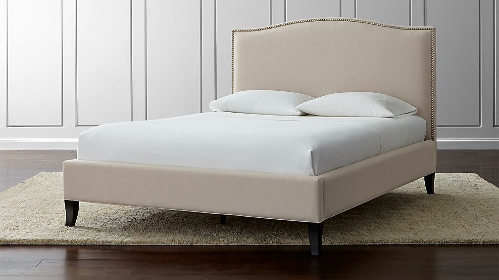
I of course love the ever popular Colette, but decided to add a slight wing more like this picture


I got to work over Christmas break with my dad's help. I showed him a million pictures, he questioned my upholstering skills and we eventually mapped out the shape.

You will need:
plywood (varies depending on bed size)
jigsaw
string
batting
memory foam
3-4 yards of fabric
staples
staple gun


I measured my plywood to be 3 inches wider than my mattress, so I would have room for batting and to attach the wings.


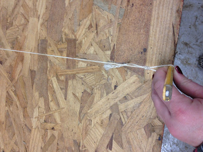
I am all right brain and was ready to just free hand the shape, but my smart Daddy came up with a much better idea. We put a nail at the bottom of the headboard in the middle and attached a string. Then tied a loop in the other end of the string. The string serves as a giant compass so you get an even arch. You can adjust the amount of arch by changing the string length or moving the nail.
One point for the left brainers!

My advice is to go slightly more dramatic with the arch. Once you add batting and fabric, the lines are really softened.


I marked each side with one inch lines and used the square to draw a straight line from the edge on each side.


Then use your jigsaw to cut out your shape.


We then added support to the back with 2x4s and to give it more height.


For the sides, we just winged it. pun intended (;  We did double the thickness of the sides to give it weight and glued them together using wood glue.


Now time for upholstery! I came across a memory foam mattress pad on super sale so I used that as my base. The edges will be rough when you cut it to fit the shape, but this will be covered in batting and a thick velvet so it's no big deal.


The back should be upholstered first.
Then the sides.


Tipper approves!


Monday, January 30, 2017

Layers of Light

I was so excited when Arhaus asked me to take part in their lighting challenge, because lighting is one the most important features of a house. For me, the key is to layer your lighting. Too often, we just use one layer, overhead lighting. However, it is best to vary height and function.

My basic rule is to use three main layers: functional lighting, a pendant light or chandelier, and lamps of varying heights. This gives you options of different lighting for various activities and casts a more flattering light. Overhead light will cast shadows and is generally unflattering, adding in lamps at eye level helps to counteract this.

Great lighting is one of the easiest ways to add style and character to a room. The biggest style impact is generally made by the overhead light. These are a few of my favorite pendants and chandeliers.

                                                                                                                                             
I would use all three of these together using the rectangular one over the dining room table, the geometric in the living room (maybe two of them depending on the size of the room), and the glass over the island.


I love the wood finish of the round chandelier, it is traditional without being too stuffy.

This beaded chandelier makes me swoon. While some might not consider it traditional, it's neutral colors make it work in almost any setting. I would keep the rest of the room pretty simple like in the room below, and let the light be the star; it adds instant glamour and style.

                         
                 This picture from Arhaus really helps get an idea of the scale and all it's awesomness!

Even better, the Lerato Chandelier helps women affected by HIV in Africa.


Once you have your overhead lighting, then it is time to add in the second layer, lamps. Lamps are like the accessories for your room. They can add a little brightness or interest to any area. 
This tripod lamp has great finishes and details that up the style factor and it works well with almost any decor.
The teardrop table lamp is one of my favorites from this entire post; it is literally like jewelry for your room. The design is sleek and elegant and how can you go wrong with crystal!?!
I love the shape of the rectangular lamp, it adds an unexpected twist and the petite height is perfect for desk top or a sofa table. 
These two really complement each other well. The finial table lamp adds some serious architectural interest.

The base layer is functional, almost every home needs recessed lighting. Something that will give you lots of light when you need it. Recessed lighting is not the star of the show, it should be in the background and set on dimmers to adjust the light.


Friday, December 30, 2016

My (sort of) New House

A few weeks ago, I posted about moving into a small house. Mine is by no means the next cover of House Beautiful.  It's certainly not perfect, but it is mine and I love it.

I don't think I could go full out tiny house, I require a separate shower and non-composting toilet, but the downsize has been nice!

It was not love at first sight, really it wasn't even like at first sight


There were cat plates all over the wall and an old lady door. It's a lot blurry, but you get the picture...


A year has passed, and a lot has changed (although the old lady door has not). I love my little old house now.

While I know in blogger world you should never show before pictures and not the after but I promise they are coming.

So for right now, just feast your eyes on all the cat plate old lady glory.


This is the view when you walk in the door.


The kitchen and the laundry area.

And the bedroom.


I have to admit, I panicked when I saw it the first time, but I love a challenge! No where to go but up, right!?


Saturday, September 3, 2016

Kitchen Obsession

I am currently jonesing for a project, so I was looking through my saved pictures for some inspiration. I came across these pictures I had saved, I am OBSESSED with this kitchen.  I'm pretty sure I found it in the Ice Age before pinterest so I'm not sure where they are from.  If anyone has a reference let me know.

I love the open shelves and aqua tile with the rustic wood ceiling. The aqua tile in this kitchen, gave me the courage to go with the colored subway tile in my kitchen. 


To me, it is the perfect mix of rustic and contemporary.  This kitchen feels so inviting and like a place you would hang out.


That granite *swoon*

So what do you think, is it love?

Sunday, August 21, 2016

Faux Board and Batten


I have been planning on redoing our water closet for ages and finally got around to it right before I moved. Lots of things have changed since this project, but I never got around to sharing it and I love love love the way it turned out.

 If you spend any time on Pinterest, you have probably seen faux board and batten. I had been wanting to try this out in our bathroom for a while now.

The master bath has a separate vanity area and then a water closet (seriously who knew there was a name for the tiny shower room!?). I originally wanted to do the whole area in board and batten to define the bedroom and bathroom space, but it just wouldn't work with all the closet doors.  In the end, I did just the water closet in board and batten using this tutorial.

The requisite before picture.


No where to go but up right!?!

It's amazing what a little paint can do.  I was so relieved to get rid of the last vestiges of the yellow beige color the previous owners loved so much.  As in, the loved the icky color so much literally every. single. room. in our house AND the baseboards were all the same color!  Maybe it was on sale...

Anyway, a fresh coat of paint breathed new life into the room.

We only painted the top half because the bottom will eventually be white.


I then put up the horizontal top board on each wall.


I painted the bottom and top board white before hanging the vertical boards. 


 For the vertical boards, I used plain lattice cut to fit.  I measured and marked each spot and then glued them in place with wood glue. I held them in the correct spot with masking tape until the glue dried. 


Once the glue dried and I could remove the tape, I caulked each side of the vertical strips so there would not be a space on the sides. 


The last step was painting over the wood strips.


It is a teensy tine room so it's hard to get a good picture, but it is a hundred times better!

What do you think? Do you love the faux board and batten look as much as I do?
It gave the bathroom a much needed facelift.